Documentary-
Radio Trailor-
Print Advert-
1. In what ways does your product use, develop or challenge forms and conventions of real media products?
Our products have not challenged or developed the forms and conventions of real media products as we wanted to produce products that were as profeesional as possible, therefore we followed the forms and conventions. Firstly, the framing of the interviewees is typical of real media products as both our interviewees are framed to the right hand side in medium close up. Their eyeline was about a third of the way down the screen.
We used graphics on each interview to anchor the relevance (who they are and their occupation) of the person to our documentary. The name is in a larger font than the occupation but both are in the same font and colour and this is the same for every interview thrroughout our documentary. The name is always on the oppostie side to the interviewee and usually at the bottom.
We used handheld camera to film the actuality footage of the drag queen, to enable us to be able to react quickly to where he went and also to make it seem more lifelike.
Beneath The Veil- Women In Islam
http://www.youtube.com/watch?v=
oTQ_Gg17k3g&feature=PlayList&p=
287C65FDD7AEB6CC&playnext=1&
playnext_from=PL&index=6
We avoided using too much background sound during interviews apart from the actuality footage of the drag queen so as the audience would focus on what the interviewee was saying.
We used a variety of shot types, camera movements and editing techniques so as to sustain the audiences interest. These included zoom in/out, panning, fast motion, tracking and fade to black/from black.
Beneath The Veil- Women In Islam
http://www.youtube.com/watch?v=oTQ_Gg17k3g&feature=PlayList&p=287C65FDD7AEB6CC&playnext=1&playnext_from=PL&index=6
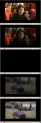

Example of zoom in-
http://www.youtube.com/watch?v=ChN4QvbbpFM&feature=PlayLi
Example of panning-
BBC Documentary :Time Machine - Masters Of Time 1
http://www.youtube.com/watch?v=UmUaZpr6oVc
We used fast motion whilst the titles were being written so as they wern't too slow and our audiences interest wasn't lost.
The mise-en-scene is relevant to the topic.
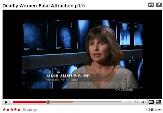
We sat our female wearing make-up at a dressing table with mirrors- a typical place wear people do their make-up. Similar to the real media product were the the pathologist is sitting infront of several Xrays. The drag queen is looking in a mirror doing his make-up which again gives connotations of make-up.
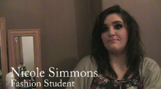
The mise-en-scene is relevant to this interview with a drag queen as it has several images of drag queens in the background. We positioned our drag queen infront of a mirror so he could do his make-up and talk to us and we also hung one of his dresses at the side of the mirror to give connotations of drag.
The voiceover uses standard English and is the age of the target audience, he sets the scene, holds the narrative together of our documentary and introduces each topic, links items and concludes the narrative.
We kept are editing techniques to a minimum throughout the five minutes to follow the codes and conventions of professional products. We mainly used straight cuts as they are simple and unobtrusive.
Example of straight cuts- One Inch Punch Documentary
We filmed a vox pop for the beginning of our documentary to grab our audiences attention and to allow the audience to automatically know what our documentary was about.
Our radio trailor again followed the codes and conventions of real media products by firstly, the voiceover breifly outlines the narrative and also poses two questions at the beginning to grab our audiences attention. The voiceover is appropriate to our trailor as he is within our target audience. The advert lasts around 40 seconds and has a music bed relevant to our target audience and doucmentary. The scheduling is said at the end with the last thing mentioned being the channel. We also included snipets from our documentary to entice our audience.
Radio Trailor-
Our print advert followed the codes and conventions of real media products by-
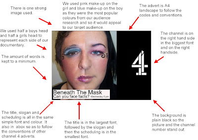
Coherence is created across all of our products in several ways. Firstly we have a consistent title which is spoken in the radio trailor and is written in both the documentary and the print advert. This connects all three products together.

Clip from radio Trailor-
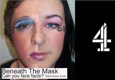
The main image in our print advert relates to our documentary as it represents females wearing make-up and also males wearing make-up. It connects our radio trailor as again the voicover and the extracts both talk about each gender wearing make-up.
As our documentary is on channel 4 our radio trailor would be played on commercial radio stations which are-
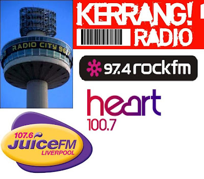 These stations our popular with our target audience so our trailor will appeal to them.
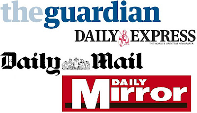
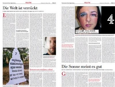
The print advert would be placed in national newspapers which would appeal to our target audience and these would be-
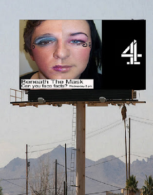
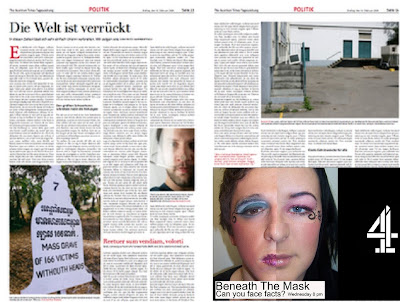
The shape of our print advert is also so versitile that it would be able to be resized to fit anywhere on a newspaper and it could also be used for other forms of advertising if neccessary Eg. a billboard. For example-
The music in our documentary and radio trailor is of the same genre and by the same artist so as to connect them both together effectively. http://www.youtube.com/watch?v=Ju-zu5hEPK4 http://www.youtube.com/watch?v=ARLGjqVCENc
3. What have you learnt from your audience feedback?
We held a focus group of 20 people in which we presented our documentary, print advert and radio advert. We then asked several questions about each product to see were we could make any improvments to our work. I also showed individual people on seperate occasions and interviewed them aswell.
We filmed several responses and also took pictures of members of our focus group who had responded to our questions.
Here are the questions we asked-
Documentary
Would you watch the full half hour?
In our focus group 90% of people said they would watch the full half an hour.

Richy 22,- "I would watch the whole thing as I liked the interview with the drag queen"
Steven, 15-"I would definately watch the full half hour"
Joel Murray, 18-
Was there a specific part of the documentary that you liked?
If there was which part?
 Hannah 17- "The shots of Liverpool were effective and I also loved the Drag Queen interview, the shots of parts of him dancing were really good"
Sasha, 18- "I thought all the shots of make-up were really creative and the opening titles were eye catching"
Do you think it was informative?
Jade, 19- "The statistics in the voiceover were interesting as it gave a clear picture of everyones opinion on make-up"
Tom, 23- "I liked the way it showed both genders wearing make-up as boys wearing make-up isn't talked about a lot."
Did you think the music fitted in with the Documentary?
Josh Hughes, 21- "I think the music was really good with the opening"

Joss 18- "I liked the music as I thought it went with the documentary really well"
Mike Crotty, 20- "The music really makes the parts with the voiceover"
Shauna White 17-

Jenni Taylor, 17- "I thought the voiceover was too quiet at the end and it could be made louder to improve it"
Print Advert
What are your thoughts about the print advert?
Heidi 18-
Naomi Forman, 17- "The print advert is really different and certainly draws your attention and the slogan is good"
Shauna White, 17- "It looks so unusual that I would watch the programme"
Heidi Crawford 18,-
Radio Trailer
What are the strengths and weaknesses of Beneath The Mask’s trailor?

Nicki, 18 (left)- "The radio trailor really made me want to watch the documentary and I really liked the music in it, but some of the voices were too quiet"
Shauna, 17 (right)- "The question at the start grabs your attention as most people do wear make-up"
In conclusion to our focus group we found out that-
- The target audience for our documentary was correct as they all enjoyed watching our documentary.
- We know the music in both the radio trailor and documentary is appropriate to the topic and also appeals to our target audience.
- We know what changes to make to our products to improve them.
- We know our print advert is very eye catching and would make people want to watch the documentary.
- We know over 90% of people would watch the full documentary.
- We also know the interview with the drag queen particularly appealed to our target audience.
4. How did you use technologies in the construction and research, planning and evaluation stages?
During the planning and research stages of our products we used several aspects of technology. We used computers and the internet to watch other documentaries and also to analyse radio trailors and print adverts (bottom left). As we decided to show our documentary on Channel 4 we looked at the website with all the print adverts for that channel (Link- http://www.4creative.co.uk/flash/#/keywords/print_ad/factual_cutting_edge_storm_junkies) We also used the internet and Google to research male make-up products (The Men Pen and GuyLiner- Bottom right) and we then used hotmail to email them (Link for websites- http://www.themenpen.com/ and http://taxicosmetics.com/taxi_guyliner.asp)

We used the internet to email and ring the head office of Superdrug and Debenhams to try and get permission to interview a make-up artist and film the make-up in the stores but we weren't given permission.
During the construction of our products we used a digital camera to take photographs to upload to our blog, to take some pictures of make-up to use as cutaways and also to take still images for our print advert. We used a tripod and video camera to film our footage. We used a microphone during the vox pop and also the two interviews to make the sound clearer and louder. We used the recording studio to record the voiceover for both our documentary and the radio trailor. We used Adobe Premiere to edit and construct the documentary and the radio trailor and we also used Photoshop to create our print advert.
Evaluation stage-




 We edited all the questions out of the interviews and used our cutaways over the cuts in the interviews. We cut the montage down and lengthened the time the opening titles were on screen so as you could read it properly. We added music to the opening titles, the cutaways of the drag queens actuality footage and also to the parts were a voiceover was used. We changed the speed duration during the opening titles so it was faster and we also used fade to blacks and straight cuts throughout to go from clip to clip. We faded the music out at the end of a section and faded it back in for the beginning of the next. We used graphics to anchor the relevance of the interviewee to the audience.


 We then had to create a print advert and a radio trailor to advertise and promote our documentary. We already had decided our target audience (14-24) and the scheduling (Wednesday 8pm, channel 4). We listened to examples of radio trailors in class to establish the codes and conventions of them.


 We wrote the script for our radio trailor which is-
 We then had to put the make-up on our boy and girl and take the pictures. Once we had uploaded the pictures we edited the face in photoshop and added the title, slogan and scheduling.


